“A cockpit instrument for the wrist — bold, readable, and beautifully restrained.”
Aviator Digest
Aviator Stories
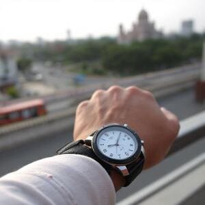
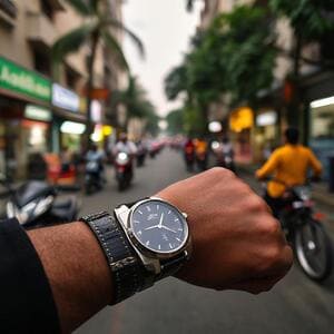
CELEST1840 follows city rhythms — sunrise trains in Mumbai, late-night rides in Delhi NCR, quiet cafés in Pune. The dial stays clear, composed, and unmistakably aviator.
These short field notes capture how the watch face behaves in real-world light: harsh noon sun on open roads, diffuse glass reflections in metro cars, and mixed lighting in bustling markets. Every snapshot is a reminder that instruments should serve the pilot, not the other way around.


In aviation, clarity is a discipline. We used the same rule for CELEST1840: information first, style in service of function.
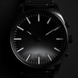
Morning rides start with bright haze. Bold numerals and the calibrated minute rail keep time readable at a side glance; the hands’ counterweights give orientation even when the wrist is turning. By noon, specular highlights intensify. Our glass simulation avoids hard glare, so the dial remains coherent rather than shiny. After dusk, ambient variants take over, simplifying layers while keeping the instrument silhouette intact.
The goal is not imitation of hardware, but transfer of its values: precision under stress, legibility under changing light, and quiet confidence when you only have half a second to look. That’s the altimeter rule: no doubt at a glance.
“You don’t need to stare. One glance, and the dial tells you everything.” — Test log, Bengaluru
Whether on a quick coffee run or a long connection across the city, the face stays the same: legible, restrained, and ready. When we design, we test in crowds, on buses, on stations — places where attention is a currency and timing is a comfort.
Logos and on-wrist frames for blogs, social posts, and storefronts. All assets are lightweight JPGs to keep your pages fast.


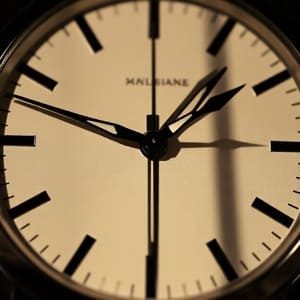
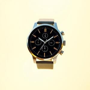
Hands define the character of an instrument. On CELEST1840, each hand is drawn like a tool: weighted, balanced, and unmistakable at a glance.
The minute hand is the workhorse — long, crisp, and slightly tapered to minimise overlap with numerals. The hour hand is shorter and thicker, with a counterweight that makes orientation instant even when the wrist is turning. The second hand is a whisper: thin, precise, and tuned to avoid aliasing on small displays.
We test these shapes in bright sun, mixed metro lighting, and night streets across India. When the world shakes around you, the geometry stays calm — that’s the point of a cockpit dial.
CELEST1840 appears in round-ups that celebrate legibility and finish. A few lines that capture the idea:
“A cockpit instrument for the wrist — bold, readable, and beautifully restrained.”
Aviator Digest
“Ambient mode that actually respects the design — minimal, efficient, still unmistakably CELEST.”
Wear OS Weekly
“It feels engineered. The hands and minute rail work like tools, not decoration.”
Design Ledger
Install the CELEST1840 Aviator Watch face and keep the cockpit mindset wherever you go.

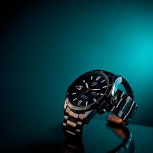
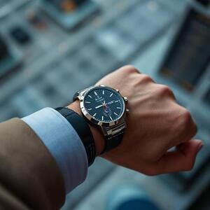
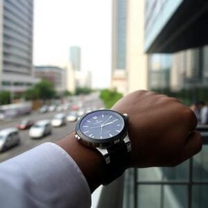
CELEST1840 travels daily routes across Indian cities: fast mornings, heat at noon, mixed lights after dusk. The dial stays composed — instrument first, style aligned with function.

Bold numerals and strong minute ticks resist the low-contrast haze near the sea. A gentle glass highlight adds depth without glare on crowded train platforms.
Ambient assets simplify layers to reduce power draw while preserving the silhouette of hands and numerals under mixed neon and warm light.
Specular highlights are tuned to prevent harsh hot-spots on glass; the minute rail remains legible at a quick glance between rides.
Choose darker colorways for sun-heavy hours; lighter palettes for offices and cafés. Auto-brightness smooths transitions.
Three frames that define the dial’s rhythm: dawn clarity, noon resilience, and night restraint. The instrument logic remains: no doubt at a glance.
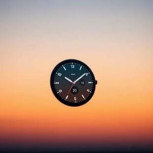
At dawn, haze can reduce micro-contrast. CELEST1840 uses sturdy numerals and a tempered glass highlight to maintain depth without shine. By noon, glare peaks; the rail’s spacing and the hands’ geometry hold shape under harsh reflections. At night, ambient switches on: simplified shadows and a reduced highlight stack carry the aviation feel while lowering draw calls.
The lesson from cockpit dials is simple: shape consistency beats ornament. The watch face honors that by keeping silhouettes stable across light scenarios, so reading time never asks for effort.
Short guidance for creators, reviewers, and stores using CELEST1840 visuals. Reach out if you need extra assets or sizes.

Yes. You can use the media kit assets and on-wrist frames in editorial and store listings with credit to CELEST1840. Please avoid altering logos or colorways beyond standard crops and resizing.

Keep the CELEST1840 wordmark intact and legible. When overlaying text on images, prefer corners with minimal highlights to prevent clashes with glass reflections and minute ticks.
Email celest1840@gmail.com with your required sizes and platforms. We’ll reply with a tailored set — square, landscape banners, and ambient variants optimised for battery-friendly demos.
A short visual essay on how CELEST1840 holds shape from open skies to dense streets. The principle is constant: clarity first, finish second.
In transit, the world moves quickly: windows flicker, shadows roll, and glass reflects more than you expect. The dial answers with stable silhouettes and disciplined contrast — the hands read as tools, not ornaments. The minute rail is your quiet metronome; each mark is a promise that time will be there when you glance again.
When the city slows, the finish shows: brushed-steel cues without heavy textures, soft lume that nods to cockpit instruments, and highlights that suggest glass rather than shouting it. The face doesn’t compete with the day; it supports it.


Editors and early wearers shared the combinations they return to. These three say a lot about everyday use.
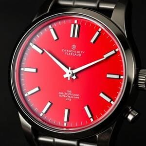
Bold numerals, confident minute ticks. Works for quick reads on platforms and bus stops; the glass highlight is tempered to avoid hot spots at noon.
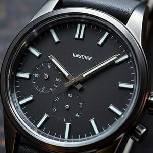
Slate stays out of the way. Designers like its neutral range and gentle shadows — legible on laptops, calm in meetings, never shouting for attention.
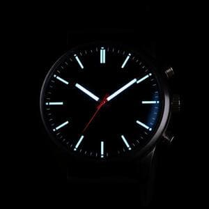
Ambient mono is efficiency with character: reduced draw calls, preserved silhouettes, and a cockpit feel that survives the darkest corridors.

CELEST1840 is a small commitment to instrument thinking: choose clarity, then style. Keep shapes stable, avoid noise, and let the watch help you move.